2022
Vanquis App
UX, UI, Product Design
UX/UI Designer

Vanquis app is a banking product that serves credit to the underserved population. As a company, we have a great responsibility to ensure that our customers have available access to credit, aswell as easily being able to pay their credit back on time, so they do not receive any extra charges.
After conducting research on our current recurring payments journeys, we found that over 8% of customers miss their first payment, and 20% go on to carry on missing payments. From speaking to customers, this can be due to varying reasons including, not having a recurring payment set up, and so they "forget my payment" to their payment coming out at the wrong time of the month.
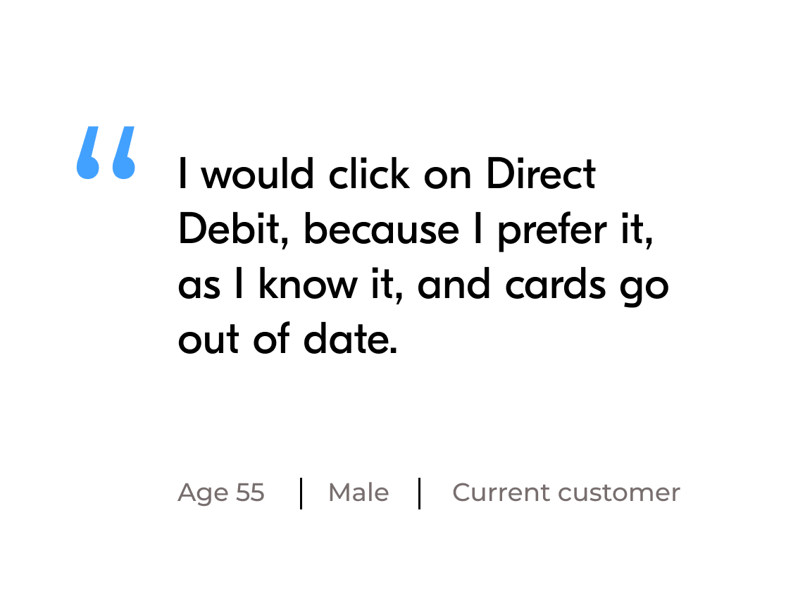
After conducting research we found out that most customers choose the Direct Debit option, as they had heard of this term, even though this option might not be best suited to their lifestyle needs. Through testing and ideation we decided not to just show the options available to the customers up front, but to ask them lifestyle questions to find out what would be best suited, aswell as educating them on both options through video content, and bitesize educational pieces.

UX research, UI design, Design lead
Initial research focused on better understanding user’s needs, and what their job to be done was.
Define and understand the problem through assessments and research
Problem solving through ideation, wireframing, prototyping and testing
Creating solutions through hi-fidelty designs, animation and usability testing
Design handoff, documentation, and business QA

A series of in-depth interviews were then conducted on 20 participants to further identify pain points, frustrations, needs, and desires with existing products to determine how we could improve the recurring payments journey


All participants used a combination of multiple apps to find, save and share restaurants
Users value the ability to customize their settings to curate things that fit their preferences
Major products in the market lack desirable features and feel impersonal, outdated and untrustworthy
A map feature with tags is paramount when searching for restaurants
Too much information on screen makes users feel overwhelmed, they'd like a more curated experience
Irrelevant suggestions feel impersonal and clutter the UI, filters are highly used tools when searching
For every product or service we design, it’s important to ask ourselves the right questions so we can anticipate potential consequences – both intended and unintended. This worksheet is aimed at helping evaluate both new (conceptual) and existing (in customer hands) products, services, and features for any potential harms and to prioritise the next steps.


To kick-off the design process, mental models led the way with innovate thinking straight from the customer, quick lo-fi wireframes helped me get ideas on out to establish which elements were necessary for each screen. A wireframe prototype was then created for initial user testing.
Psychology doesn’t just help you design micro-interactions; it can also help you use mental models to tackle big experience-design problems. We want to design this digital experience to be the same as how customer would expect to experience it in real life, or from our call centre. Understanding our customers mental models and the steps that people go through has transformed our app to live up to the customers expectations. I did this procedure with 14 customers to find out how we could improve this journey.

The new flow doesn't just overload the customer with all the options up front, instead we find out about each customer and then inform them on which option would suit them the most, and also offer education through video, and bitesize content. Allowing the customer to read and educate there-self first and then make the decision.


Lo-fi wireframes were done to get my initial thoughts on paper and brainstorm new ideas for specific UI elements. These were informed by the mental models and research on what was not working in the previous experiences.

The inclusive assessment framework was then used again to check that the new journey was putting the customer first, and to find any pain points within the journey. The wireframes were then presented to the stakeholders within the company and iterated upon 6 times. These wireframes were then signed off by the company and put through customer testing. We then landed on a final wireframe, that both the business and customer were happy with.

Can we link this journey to any other channel, send updates
Needed to add SUGR guidlines to the design
We need them to agree to a Direct debit guarantee
Split the journey for CPA/DD early after a decision tree
Put the option in the customers hand by still allowing them to switch
Re-use the registered card for "Add a payment card"
To create the designs for the recurring payments journey, I used the design system that we have set up at Vanquis. However, whenever there is a new journey designed we have to create a backlog of any new components that are needed.
These then get passed over to the design systems backlog and go through a process of testing to ensure that all designs that go out meet our design philosphy and standard.

The updated journey, which is shown on the right, no longer starts the customer off from a page, where they need to make a decision without any education or background on their needs. Instead the new journey is customised by each customer, and understands and learns what is best for them, before showing the customer their options.

To access the recurring payments the customer enters from this page, which we also redesigned

Integrates all needs into one streamlined experience
Suggests more personalized restaurant recommendations
Supports social connection and engagement
Saves favorites for quick reference later
Gives users more flexibility to create specialized lists
Provides a source of reputable reviews from trusted friends and influencers